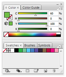
Below you can see the Colour Mixer and the Swatches windows.
By default there are loads of different swatches in that window, but in this image I have deleted them all.
The obvious use for using swatches is that if you have several things that need to be the same colour then you can just use a swatch and not risk making a different colour.
On screen it could like the same colour but you can use a swatch to make sure.
If you are dealing with a large scale print job and you accidentally use a colour that isn't meant to be there then it could need an entirely new plate and cost a lot.Once you have messed around with a colour in the colour mixer window on top then you can use the small 3 horizontal lines icon to show the menu for that window.
You add this colour to the swatches by pressing "Create New Swatch..."
You can see below the window that comes up when creating a new swatch. It shows the levels of each colour CMYK in percentages and also shows that it will be a 'Process Colour'.
Process Colour in this instance is synonymous with CMYK; It just means that the colour will be made up of Cyan, Magenta, Yellow and Key Black when printed. Click 'OK' and the colour is added to your swatches.
Below you can see that I have used the new swatch to give colour to 3 basic shapes.
 You can make as many swatches as
you need for the work that you are
doing.
Just try not to get them mixed up.
This time I have checked the Global box. When this box is ticked the swatch becomes global. That just means that when the colour of the swatch is changed then any shapes of strokes with that colour are also changed to the new colour.
Instead of always using Process colours you can also use Spot Colour.
If you imagine that process colour means there are 4 colours used to create other colours (CMYK) so a certain proportion of each of those colours is laid down on top of one another and the colours blend a bit and it creates other colours. In Lithographic printing that would require 4 seperate plates (One for each colour).
Spot colour is just one colour that has been pre-mixed.
It doesn't need to use CMYK to build up the colour, it already is that colour. It potentially means that you can get a broader range of colours than those which can be made by CMYK and the colours can be specialist colour like Silver which cant be produced by CMYK inks. It also means that if you are simply printing something which is just one colour on white paper, you only need the one plate for the spot colour instead of the 4 plates that CMYK would require. You can also use tones of the spot colour which would not need any more plates as they are effectively just different concentrations of the colour.
Pantone is the English standard for colour recognition and Illustrator has all the Pantone colour books within. These Pantone swatches can be found in these menus shown on the left and above.
The Pantone swatches are spot colours.
They are really useful for realising exactly what a colour looks like in print format instead of on screen where colour can change a lot depending on your monitor settings.
If you find a Pantone colour in the physical pantone books that you want to use then you can search that colours reference and find it on illustrator. That will then be the exact colour that it will print out on in that specific stock.
These are the Pantone solid uncoated spot colours shown in a seperate swatch window. You can tell that they are spot colours because of the little spots in a triangle in the bottom right of each swatch.
These colours can not be edited because they are effectively already pre mixed.
This is the swatch options window for a Pantone Rubine Red spot colour. You can see how different it is to the Process colour in that you can not change any of the options. The Pantone swatch can not be edited (Although you can still generate tints) so you use it when you know that it is the right colour to use.
Although you can not edit a Pantone spot colour, you can get Pantone process colours which are bascally just CMYK replications of a spot colour. In this instance you can check for a colour that you want in a Pantone book and then use Pantone process colours to get a colour as close as possible to the spot colour while still using CMYK.
The two main reasons for picking spot colour over process are:
Cost - It may be a lot cheaper to use spot colour if you are using only a few colours because it may require less plates than CMYK printing
Accuracy - You can be certain of a colour using spot colours and you can be sure that you have the same colour on any later reproductions you do in future. You can also get specialist spot colours to give different textures and metallic effects.


No comments:
Post a Comment