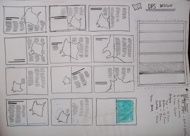
Here is the designing for the double page spread. This idea is for the DPS to go inside the in-flight magazine that they have on flights. When the passenger sees the packaging they will notice that is says "For more information see page 10 of the in-flight magazine" which will hopefully make them turn to page 10 and read the article which will go into more detail about the manta ray situation.
The image below shows my first set of thumbnails to come up with some ideas about the layout of the DPS.
Some of them would work better than others but they all quite interesting ideas I think. On the right is a little diagram showing the layout of the indesign document with margins and columns etc.
The document setup is like this:
DPS
2 x A4 pages - 210 x 297 mm
3 columns on each page
Gutter - 4.5mm
Margins:
Top - 12.7 mm
Bottom - 12.7 mm
Inside - 8mm
Outside - 15 mm
Bleed - 3mm
I remembered that I had one image left over from when I made 6 illustrations instead of 5 and decided that I could use the remaining one for this spread. I looked over at the old image and realised that it wasn't great quality and thats probably why I didn't end up using it for final packaging so I drew out a new one with a bit better quality of lines and detail.
Then I chose this thumbnail to try and recreate in Indesign.
I used the guides and columns to lay out the spread appropriately and tried to incorporate the illustration as best as possible to simulate the thumbnail.
This is the final DPS that I have created to use on the boards. I used the spot colour with the overprint fill to try and link it to the packaging but I created these more abstract shapes instead of the straight bars on the packaging. I'm still not entirely sure about this spread. I can't really tell if I like it or not but hopefully the final crit will be able to give me some ideas about changing the design if I have to.
The image below shoes the spread in context as part of a magazine. This is just to show the kind of thing it would actually look like when printed.


No comments:
Post a Comment