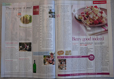
I started out by creating a new document as 2 single pages and then dragging them together in the 'Pages' tab to make a double page spread. I input the margins, columns and gutters when I created the page so that they perfectly matched those in the magazine.
I then went on to take elements of the magazine and either recreate them on Indesign or Photoshop or scan them straight from the magazine if they were images. I then just started to move elements around and line things up with the grid to try and create a new interesting layout.
Above I have shown the original double page spread so you can see the grid and how it was laid out.
Underneath that is my own spread so far with the grid layout on top so that you can see it matches exactly with the one above.
Finally underneath is my spread so far as it would look printed.
i really like the look of it so far, especially how I have photoshopped the image out of it's box and word wrapped it so that the type flows around it. I have kept all of the same elements of the text that fits with the main image, even the change in colour, boldness and other small section (e.g. the small red box that says 'Easy'. I also really like how the spoon handle pushes in to the text. I think it shows that the image is almost more important than the text because the image has the ability to intrude on the text and change it from the normal column layout of a generic magazine to a completely alien format.
I also like how I used the pen tool to create an invisible curved line around the bowl and then set the type to the curved path to make the heading, 'Berry good indeed', bend around the top of the bowl, again making the image itself the most important part of the article.
I will finish the spread by adding more to the left side of the page, but I will experiment in leaving the white space on the right side because it makes the page way less cluttered and suggests a quite clean and fresh quality which then attaches itself to the food.


No comments:
Post a Comment