I want to create a logo for the product which can be used across a range of products and link them together. Some bits of context have helped me decide that the logo should bold and representative of the product or topic. In this case I am trying to tell people not to eat manta rays so I am effectively creating a campaign. That means that I should be representing the idea of understanding manta rays and that they should not be eaten.
A logical place to start would then be to design a manta ray logo.
This was the first kind of logo design that I looked at and I tired to come up with a few different angles and methods of representing a manta ray well. I noticed quickly that one of the most recognisable thing about a manta ray is its mandibles which other rays do not have so this should definitely be in the logo design.
I also noticed the underside gills on a manta ray which are quite unusual and saw that they resemble human ribs quite well which could be a good link to the fact that manta rays will die out.
Below I started to look at the top down view of a manta ray and the view of a manta jumping out of the water. As far as I know Manta Rays are one of the only large fish that choose to jump out of the water in this way so it gives them a kind of unique selling point that I can take advantage of. The pose of the manta ray as it jumps out the water has really nice dynamic angles and looks almost like it is flying away. Here I experimented with sketchier and messier drawing but I think that the more precise look works best. I also experimented with having the fins either up or down during jumping but it makes a much more interesting and recognisable image if they are up.
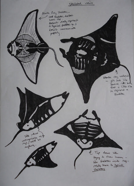
Here is where I started experimenting with the idea of making the manta rays all skeletal to connote death and then link it to the idea that if manta rays keep being eaten then they will die out. The top right image shows a normal underside of a manta ray with some unusual shading. It creates a nice image but the problem is that the gills on the underside of the ray are the only thing that look skeletal on the outside of the ray.
In the top left is a drawing of what a manta ray skeleton actually looks like. It is an interesting and detailed skeleton but it doesn't really represent a conventional skeleton look so it doesn't help to communicate the idea of death. Below the top images are some examples of experimenting with human-like bones to try and retain the connotations of death but I don't think they have worked particularly successfully.
Here are some more precise and thought out logo designs using the idea of the manta jumping. I like the simplicity of the shape and the way that it is basically just in two parts but still represents a manta ray quite well. I think that the best example may be the logo which uses cross hatched style lines to represent shadow. This would be more useful if included in another image because the lines help to define the boundaries of the form which could get lost if it was say on a black background.
I think that the design could benefit with some type as well.


No comments:
Post a Comment