1. What skills have you developed through this module and how effectively do you think you have applied them?
The main skills that I have learned over this module have been related to designing for print production in terms of software. I have learned a lot to do with setting up documents ready for printing in Illustrator, InDesign and Photoshop and how to produce a lot of different effects for printing (For example, overprinting / knockout printing). These skills have helped me a lot in this project as it meant that when I came to print in the end there were less problems, especially in comparison to some of the briefs last year where everything started going wrong when printing came around.
I have also learned how to manage files properly for print and recognise how to make sure that everything is set up and managed properly when it comes to final prints. This makes everything run a lot more smoothly and it means I had more time to deal with designing instead of worrying about printing and having missing files and links.
In terms of knowledge I have learned a lot about the different kinds of print processes and how they are relevant in the graphic design industry. I now know quite a lot about which processes would be used in which situations and about how some specific types of products are printed and the procedures that they go through to get to a good quality end result as well as learning about specialist print processes such as spot varnishing and embossing.
On top of that I have learned how to recreate a mock up process for embossing and foil blocking which works quite well to represent how it could be used in industry and has an alright quality.
All in all it has produced a lot more opportunity for design solutions in future and a much better understanding of how to produce print to a higher quality.
2. What approaches to/methods of research have you developed and how have they informed your design development process?
My approach to research for this brief has been to show everything almost solely in the form of the blog. Last year I would use a sketchbook to show a lot of my research work and then blog it at a later time but in this brief I have stuck to trying to use the blog to show my research in a managed and chronological way so that it can be used as a clear and coherent reference when looking over it and selecting appropriate parts later on.
I think this worked really well because it meant that I could take advantage of the fact that it is digital by using search functions and tags to quickly be able to find bits of research that I want to reference or look at again.
My handwriting is quite messy and sometimes hard to read so using the blog also helps to eradicate any readability issues for me or anyone else looking through it.
In terms of primary and secondary, the majority of my research since the summer brief has been secondary qualitative and quantitative as i found it really hard to find any primary research relevant to the brief. Over the summer I did manage to get some good primary research though and it helped to link over into the start of the year.
3. What strengths can you identify in your work and how have/will you capitalise on these?
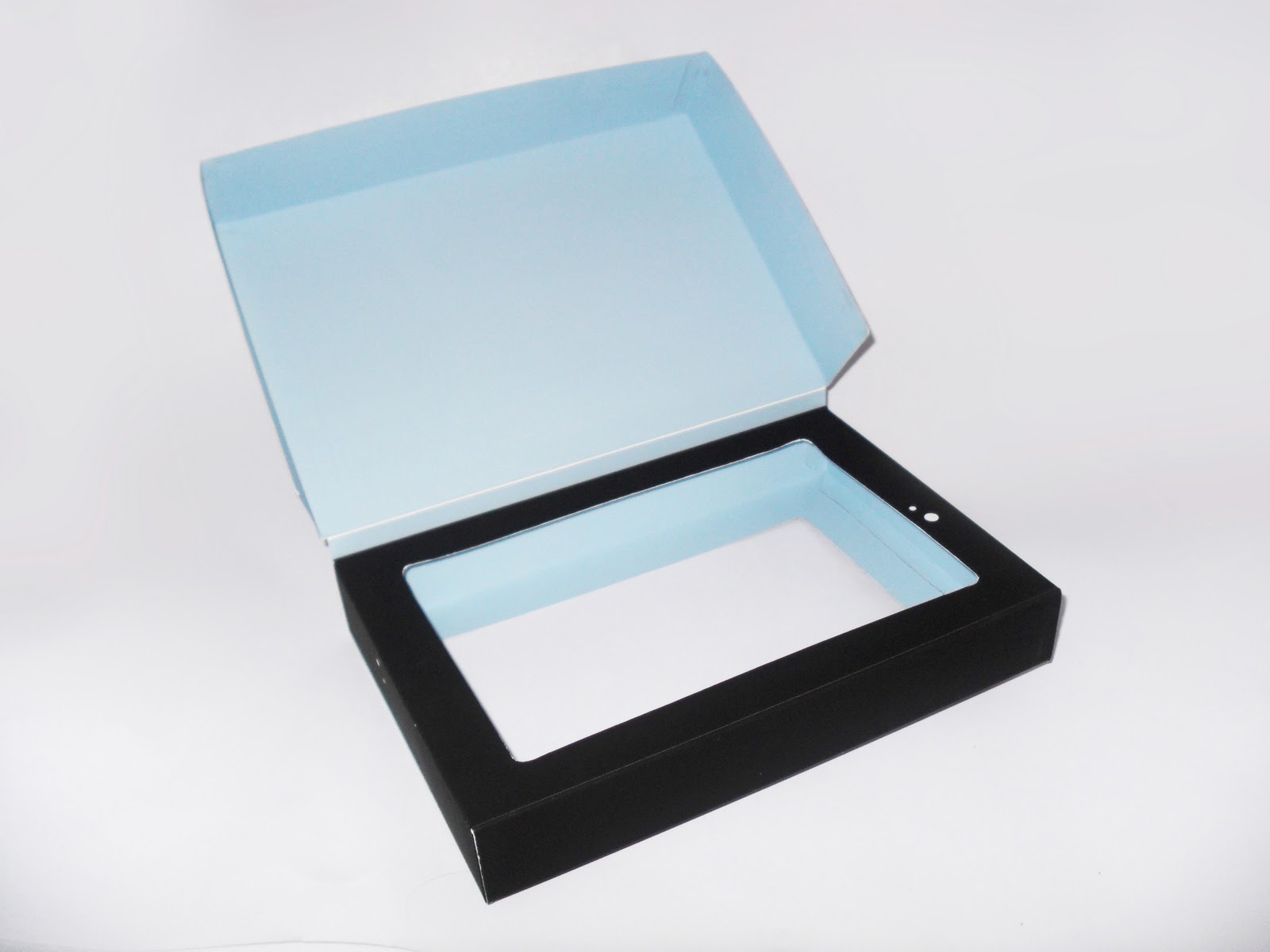
I think that probably the biggest strength in my work for this module has been my improved use of design software for printing processes which has made my end products come out quite well. I also tried quite a lot harder with finishing quality for this module which I think shows in my packaging. In my past work I have struggled quite a lot with crafting quality, as I always end up cutting wrong or making marks on my work or getting glue everywhere. For this brief I consciously made a lot of effort to keep my work at a high finished quality which I think shows and is considerably better than previous attempts at finishing.
I think that my use of illustration worked quite well over this module which is positive and is something that I have been meaning to integrate into my work more and more.
I have always been quite good at drawing and illustrations in a few different styles so i have been wanting to take advantage of that as a skill. I think that this module was a good step in the right direction for including illustrations and I think it turned out quite well as an end result.
4. What weaknesses can you identify in your work and how will you address these more fully?
The main weaknesses for this module are probably layout design and product range. A few different things throughout the module have required some layout design to make the designs work and I'm not really that confident in layout as a field. I have only really worked with layout a few times and it is quite integral in most design.
The issue that I have the most is that I keep moving things around on a page and eventually I can't tell what looks good and what doesn't anymore.
I think that I could benefit with researching layout more an developing some kind of practice for working with layout design as a starting point.
By product range I don't necessarily mean quantity of work because I feel like I have done quite a lot of development and research but looking over my resolutions I feel like I should have some more products in the range to support the campaign.
5. Identify five things that you will do differently next time and what do you expect to gain from doing these?
- Try to get some more primary research to support my secondary research. This should hopefully back up my design and development solutions a bit more.
- Research basic layout design and come up with a practice to use as a staring point. This should hopefully help me with layout design and stop me getting confused about what does or doesn't look good.
- Create a wider product range. I never usually create a wide range of products as I often focus a lot of one or two products. It would be good to see a large range to see how I can make branding work across more products.
- Use more colour. I think that working with a distinct lack of colour in this module was a good idea but it made me realise that I often don't work with much colour and it would be nice to create some really vibrant designs.
- Be ambitious. I usually spend quite a lot of time justifying my design decisions and making sure that they are viable when I could just be designing and making the end result better. Sometimes things don't have to be realistic to work which is something that I need to understand.
6.How would you grade yourself on the following areas:
5= excellent, 4 = very good, 3 = good, 2 = average, 1 = poor
Attendance = 3
Punctuality = 4
Motivation = 3
Commitment = 4
Quantity of work produced = 3
Quality of work produced = 4
Contribution to the group = 4


2. What approaches to/methods of research have you developed and how have they informed your design development process?
My approach to research for this brief has been to show everything almost solely in the form of the blog. Last year I would use a sketchbook to show a lot of my research work and then blog it at a later time but in this brief I have stuck to trying to use the blog to show my research in a managed and chronological way so that it can be used as a clear and coherent reference when looking over it and selecting appropriate parts later on.
I think this worked really well because it meant that I could take advantage of the fact that it is digital by using search functions and tags to quickly be able to find bits of research that I want to reference or look at again.
My handwriting is quite messy and sometimes hard to read so using the blog also helps to eradicate any readability issues for me or anyone else looking through it.
In terms of primary and secondary, the majority of my research since the summer brief has been secondary qualitative and quantitative as i found it really hard to find any primary research relevant to the brief. Over the summer I did manage to get some good primary research though and it helped to link over into the start of the year.
3. What strengths can you identify in your work and how have/will you capitalise on these?
I think that probably the biggest strength in my work for this module has been my improved use of design software for printing processes which has made my end products come out quite well. I also tried quite a lot harder with finishing quality for this module which I think shows in my packaging. In my past work I have struggled quite a lot with crafting quality, as I always end up cutting wrong or making marks on my work or getting glue everywhere. For this brief I consciously made a lot of effort to keep my work at a high finished quality which I think shows and is considerably better than previous attempts at finishing.
I think that my use of illustration worked quite well over this module which is positive and is something that I have been meaning to integrate into my work more and more.
I have always been quite good at drawing and illustrations in a few different styles so i have been wanting to take advantage of that as a skill. I think that this module was a good step in the right direction for including illustrations and I think it turned out quite well as an end result.
4. What weaknesses can you identify in your work and how will you address these more fully?
The main weaknesses for this module are probably layout design and product range. A few different things throughout the module have required some layout design to make the designs work and I'm not really that confident in layout as a field. I have only really worked with layout a few times and it is quite integral in most design.
The issue that I have the most is that I keep moving things around on a page and eventually I can't tell what looks good and what doesn't anymore.
I think that I could benefit with researching layout more an developing some kind of practice for working with layout design as a starting point.
By product range I don't necessarily mean quantity of work because I feel like I have done quite a lot of development and research but looking over my resolutions I feel like I should have some more products in the range to support the campaign.
5. Identify five things that you will do differently next time and what do you expect to gain from doing these?
- Try to get some more primary research to support my secondary research. This should hopefully back up my design and development solutions a bit more.
- Research basic layout design and come up with a practice to use as a staring point. This should hopefully help me with layout design and stop me getting confused about what does or doesn't look good.
- Create a wider product range. I never usually create a wide range of products as I often focus a lot of one or two products. It would be good to see a large range to see how I can make branding work across more products.
- Use more colour. I think that working with a distinct lack of colour in this module was a good idea but it made me realise that I often don't work with much colour and it would be nice to create some really vibrant designs.
- Be ambitious. I usually spend quite a lot of time justifying my design decisions and making sure that they are viable when I could just be designing and making the end result better. Sometimes things don't have to be realistic to work which is something that I need to understand.
6.How would you grade yourself on the following areas:
5= excellent, 4 = very good, 3 = good, 2 = average, 1 = poor
Attendance = 3
Punctuality = 4
Motivation = 3
Commitment = 4
Quantity of work produced = 3
Quality of work produced = 4
Contribution to the group = 4