This module has definitely been one of the most useful in the course so far for improving my skills in graphic design as a practice. The mixture of briefs in the module has forced me to create a lot of different outcomes and use a lot of different skills to create the resolutions, most of which I think have been the strongest resolutions of the year.
The YCN brief was a collaborative brief, which is the only time that I have ever worked in a partnership with just one other person. Originally I thought that this could have been difficult and really annoying when it came to decision making and designing, but the extent of the brief proved that to be wrong. I think that my collaborative partner was really well chosen, as Will and I share some design skills but also both have specific traits that the other does not. In this way we were able to compliment each others skills and create some really effective work that I don't think either of us could have done alone. It is this that has shown me the advantages of collaborative work, as even something as seemingly small as initial idea generation can make a brief turn in a completely different direction. Collaboration opens up a lot of doors that wouldn't be there on an individual project.
I think that there were still some aspects of the collaboration that required compromise on both of our parts. After all, design is very personal and very subjective and both of us have a different taste when it comes to what we like and what we want to create.
My strengths in this brief would definitely have been working with the logo and symbol when creating the packaging. I think that we worked really well together and the resolution boards show this.
The web design brief was one that I was actually really interested in. I have had a bit of experience in the past working with web design but have since forgotten the most of it. When we began learning in the sessions again, I found that a lot of the basics came back to me pretty quickly, and when it came to actually creating the 5 page website I think I remembered a lot about the structure of HTML and the use of CSS that helped. Of course it was insanely frustrating and there were a lot of things that made no sense to me, but I found it really satisfying and quite fun to create the pages when they worked exactly as planned. There are a couple of the pages that I would like to change in future as I don't think they support the others, specifically the 'About' page and the 'Checkout' page. I think that web design is definitely something that I could explore more in future, although I would need to really know a lot more about design for web. This was a really useful brief in the module and has taught me some things that I can definitely take forward.
The final stage of the module was the Product, Range and Distribution brief. This was definitely the most fun of all the briefs in the module and it was probably the most useful in terms of my development as a designer. The best thing about the brief is that it was pretty much completely up to me when it came to choosing what I wanted to do. My strengths and my interests mostly lie in illustration at the moment and I would like to move more towards animation. As such, I chose my brief accordingly and focused it on the Annecy International Animation Film Festival. The main focus of the brief was probably the branding, where I gave the promotional campaign a logo and an identity in terms of style and character. This is one of the first pieces of design where I feel like the branding actually worked really successfully and could have been spread across pretty much any other promotional media and work effectively. This is something that I am a bit disappointed that I did not give myself more time to explore.
My strengths within this half of the module were definitely in illustration and in branding. I was really confident with my illustrations and I feel like the mailshot and the posters are all quite effective and relate to each other and the brief really appropriately. The branding is probably the best that I have created, even after trying in other modules and other briefs and I am really happy with the type-as-image style logo design.
My biggest weakness in the module has definitely been my time management and the amount of work produced. In fact, time management in this module has been fairly average for me although it still needs some real improvement as I find it difficult to judge how long to leave for certain things and end up getting behind quite quickly. As for the quantity of work produced, I think this is just because I take way too long to make things. I spent the majority of all my time in the studio during this module and spent hours at a time producing work. Even after all this time, I still end up with very little work compared to the hours that I have put in, which suggests that I need to speed up my work process and compromise with some things rather than try to make everything perfect.
In total this module has probably been the most useful, effective and the most enjoyable overall module of the year. It has taught me a lot about working in a collaborative team and yet also about working effectively in a completely independent and self-driven environment. I have become more confident in using illustration skills and even in things like layout which is quite unexpected. At the end of this module I have created some of the strongest work that I have so far over the entire course and am looking forward to continuing the same level of quality into the third year.
Showing posts with label OUGD203. Show all posts
Showing posts with label OUGD203. Show all posts
Friday, 27 May 2011

YCN - Final Boards
These are the final boards for module submission based on the YCN collaborative brief with Will Skane-Davis. I kept the same kind of look as the boards that we submitted together but simplified the layout and made it mostly revolve around the parts that I did, which were the logo design and redesigning the packaging for the chocolate bars.
I think that these boards work quite well in explaining the progression of the brief and what parts I did and why, although I'm not that happy about the layout on one of two of the boards as it just looks a bit messy and uninteresting.
I think that these boards work quite well in explaining the progression of the brief and what parts I did and why, although I'm not that happy about the layout on one of two of the boards as it just looks a bit messy and uninteresting.
Product/ Range/ Distribution - Final Boards
These are the updated final boards for OUGD203 submission. I have added a bit more information from last time and some more images to show the focus of the brief and to just show a bit more of the work from the module. All in all I am pretty pleased with the way these boards have turned out and with the module as a whole.
Posters - photographs
To photograph the posters I used a lighting setup with a tungsten light and umbrella, taken with a DSRL for higher quality. I think the setup looks pretty good and does the designs justice.


Web Design - Straight Cuts
For this part of the module I had to create a 5 page website for the enterprise company 'straight cuts' with any subpages if needed. To start with I laid out some really rough thumbnails to get an idea of what the site might look like.

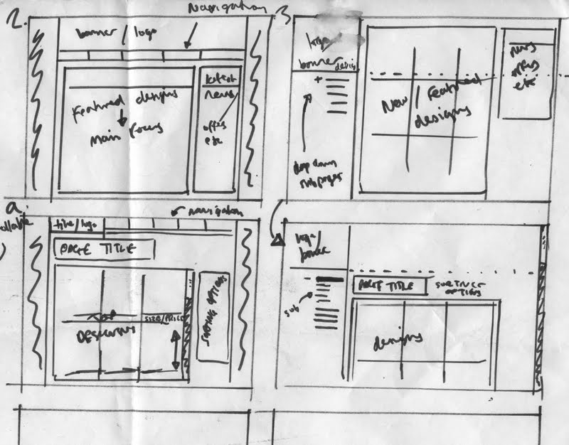

 Obviously I did realise that it would be really difficult to create it 100% exactly like this image, but it is a good way to get the representation and the idea of what I want before actually trying to make it in HTML. I then went straight into Dreamweaver and started using tables and images to build up the website in a basic way. I used a mixture of HTML for the main coding, CSS for specific classes like headings, titles or even just areas of width and Javascript for the rollover buttons.
Once I had the one page done, I made it into a template so that I could make new pages that look exactly the same.
Below you can see the editable regions that I made to stop everything from being able to be edited and messed up.

This is what the above layout looks like in the web browser:

After this I started working with each of the pages in succession to make them look appropriate to the company and to the brief. Below you can see the development of the 'Designs' page.


I also wanted to create a 'Checkout' page which would have editable form in them. Forms are like the bits in websites where a user can enter text, for example in a search bar or in filling out details for payments as in this example. I figured out how to put in the forms, but they stuck to a specific size that wasn't really changeable and it ruined the rest of the layout of the page, so I had to change this idea and just use a screenshot of another webpage's checkout to represent what it could look like and where it would go on my page


This is the final 5 pages in screenshot form:


I'm pretty happy with all of the pages except the Checkout page, which I would have liked to try again and get the forms to somehow work properly.
I chose the design that I wanted and moved into illustrator to recreate what I would want it to look like in the end. This is what I came up with as a final design that I would be really happy with:
Once I had the one page done, I made it into a template so that I could make new pages that look exactly the same.
Below you can see the editable regions that I made to stop everything from being able to be edited and messed up.
This is what the above layout looks like in the web browser:
After this I started working with each of the pages in succession to make them look appropriate to the company and to the brief. Below you can see the development of the 'Designs' page.
I also wanted to create a 'Checkout' page which would have editable form in them. Forms are like the bits in websites where a user can enter text, for example in a search bar or in filling out details for payments as in this example. I figured out how to put in the forms, but they stuck to a specific size that wasn't really changeable and it ruined the rest of the layout of the page, so I had to change this idea and just use a screenshot of another webpage's checkout to represent what it could look like and where it would go on my page


This is the final 5 pages in screenshot form:
I'm pretty happy with all of the pages except the Checkout page, which I would have liked to try again and get the forms to somehow work properly.
Ticket
As oart of the range i wanted to create a ticket to the event. The ticket needed to be kept quite simple but still relate well to the festival using the branding and style of everything else.
First of all I drew out a new unique picture from everything else but featuring the same characters.


First of all I drew out a new unique picture from everything else but featuring the same characters.

I put it into illustrator and traced it.

Then I started to make the ticket. I kept to the same colours and style and added some information about the event as well as a 3D barcode, which is the standard for most tickets at the moment. I also put it slightly more into context by distorting the image to look a bit more like proposed tickets.
Product/ Range/ Distribution - Boards
These are the boards for the final crit of the module. I have tried to keep them simple and include all the relevant work for the brief and the outcomes to make sense in the context of my rationale. I am pretty pleased with the boards in all, although they do need some work and a few more images and text being placed because there are some gaps at the moment.
The feedback from this crit was generally really positive about the boards. I need to include a bit more information in some areas as it apparently isnt quite clear what I am trying to show and I also need to show a bit more work. I'm probably most pleased with the layout on some of the pages, as layout is definitely a weakness for me but in these boards I seemed to be able to make some of the layouts look good in my opinion.
The feedback from this crit was generally really positive about the boards. I need to include a bit more information in some areas as it apparently isnt quite clear what I am trying to show and I also need to show a bit more work. I'm probably most pleased with the layout on some of the pages, as layout is definitely a weakness for me but in these boards I seemed to be able to make some of the layouts look good in my opinion.
Poster 5 - The chase
This scene shows the chase between the lumberjack and the pine tree following the thunderstorm. The pine tree has gone a bit mental. First I drew it out by hand.

Then put it into illustrator and coloured it.


Final:

Then put it into illustrator and coloured it.
Final:
Poster 4 - Thunder Strom
This poster shows the thunder storm that hits the pine tree with lightning and brings it to life. After this, the tree sees all the destruction and hunts down the lumberjack.
I started by drawings the scene as usual.

I put it into illustrator and traced it with the pen tool for accuracy, then coloured it. I messed with the colours a bit to get the contrasts right and then stuck on the Annecy logo.


This is the final:

I started by drawings the scene as usual.
I put it into illustrator and traced it with the pen tool for accuracy, then coloured it. I messed with the colours a bit to get the contrasts right and then stuck on the Annecy logo.
This is the final:
Poster 3 - Trees cut down
Poster 3 shows the forest just after the lumberjack has cut down every tree except one. The clouds show that something bad is on its way. First I drew it on paper like this:

Then traced it into illustrator and coloured it. The colours were pretty easy on this one and i didn't really have any trouble with them, but the shading was much more difficult. The hills looked a bit weird without shadow, but i think they looked even weirder with shadow.


So I settled on having them without.

Then traced it into illustrator and coloured it. The colours were pretty easy on this one and i didn't really have any trouble with them, but the shading was much more difficult. The hills looked a bit weird without shadow, but i think they looked even weirder with shadow.
So I settled on having them without.
Poster 1 - Truck
When making the posters I had already worked out what order I wanted them in and what scenes from the narrative I wanted to show.

For the first poster I was showing part of the story where the lumberjack approaches the forrest in his truck. This is a slight variation of the image shown above, but has the same principle.
I started by drawing out the scene by hand.


After settling on the colour designs I then had trouble adding the Annecy logo as the contrast in colours made it quite hard to see and read easily.


Eventually I managed to move everything up a bit and change some colours to make the Annecy type stick out a bit better. I'm still not completely happy with this design but I think it will have to do for now without starting completely again.


For the first poster I was showing part of the story where the lumberjack approaches the forrest in his truck. This is a slight variation of the image shown above, but has the same principle.
I started by drawing out the scene by hand.
Just like the others, I vector traced it by hand for accuracy and then went about colouring it. I had some troubles with colour in this one as I couldn't quite get it to work. I wanted to use the same shadowy effect to link it to the first poster that i made(poster2) but it didn't seem to really work.
After settling on the colour designs I then had trouble adding the Annecy logo as the contrast in colours made it quite hard to see and read easily.
Eventually I managed to move everything up a bit and change some colours to make the Annecy type stick out a bit better. I'm still not completely happy with this design but I think it will have to do for now without starting completely again.
Subscribe to:
Posts (Atom)