The idea came about to create some kind of logo or symbol that could be used to represent the packaging and maybe the campaign as a whole. I started by thinking about what could be used as the symbol and thought about using the leaf and what it stands for.
Using the leaf alone seemed a bit too simple as it is already used on the existing packaging and is too similar to use in new packaging. I then thought about what the leaf actually is and realised that it is meant to represent a cocoa leaf.
From this I thought that the symbol could possibly be something to do with the actually cocoa leaf or cocoa beans which lead me to come up with this concept for a logo.
The idea was to show a cocoa bean/ pod split in half with the existing cocoa leaf design being used as leaves coming out of the top. I thought this worked ok, as this is pretty much exactly what the cocoa pod looks like split in half showing the beans inside.
That is until Will pointed out that it looks a lot like a hand grenade.
Now all I can think is that it looks pretty much exactly like a hand grenade.
So I started from scratch and thought about keeping it much simpler. I talked to Will about it and said that I wanted to keep it simple and maybe use the cocoa leaf in some way, at which point Will suggested that I use 20 of the leaves to represent the 20 years that the company has been around for.
I thought this was a really good suggestion and got on with trying to design a logo for 20 leaves together in some way.
This 10 x 2 idea works ok visually but is very similar to the background pattern and wouldn't really stand out.
This design is a bit more complex and looks different to the one above but is still a bit similar.
And again the 10 x 2 variation seems a bit too much like a pattern than a logo.
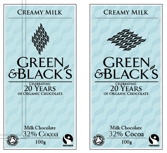
So I started working with 5 x 4 shapes instead and I think it made some much more interesting results.
I experimented with a few different variations of using the 4 x 5 symbol in different rotations and different positions on the packaging. I like most of these variations, but decided to settle on this last design for a template of all the packaging.
I think this packaging works well and will work well across the range, changing the background colour and the leaf pattern colour. Im still not sure about the "Celebrating 20 years of organic chocolate" part of the design but it works well enough for now. Here is a view of the original and the redesigned packaging.
And the 20 leaves for 20 years symbol.